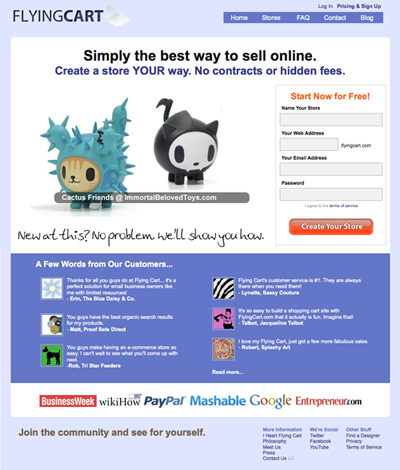
Last week we launched a shiny new Flying Cart website. A site needs to reflect a company’s personality like the clothes we wear. The old site had us stuck in the clothes that our mother dressed us in and we wanted something new. It took some hard self-reflection but we came out with a new look that we really like. The new site is lighter, more colorful, and more playful.

Besides the new colors and layout, some of the major changes to the site include: more featured stores, new testimonials, an updated pricing structure, and a new sign-up page. The Headquarters pages and the blog also match the new site design, for a seamless Flying Cart experience.
If you are interested in getting a custom design for your Flying Cart store, take a look at the new “Find A Designer” page. We have partnered with several freelance designers and companies who will create custom designs for Flying Cart stores at a good price.
Go explore the site and see what else is new.
Tags: website
